Brand guidelines
Cal Renshaw: the brand
The single reference for every cover, page, listing and post in the series. If something here and something elsewhere disagree, this page wins.
Positioning
Books for one person building, charging for and running small software products, written by somebody with a large graveyard and good notes on it. The authority is volume and failure: roughly 30 launches, 25 dead, every one written down. Never fame, funding or a qualification.
One line: I have failed at this more times than most people have tried it, and I wrote down what happened.
The name
Cal Renshaw is a pen name, disclosed on every copyright page. Short, plain and easy to say out loud, it belongs to a developer rather than a founder: the name you'd find in a commit log, which is where he spent 14 years. The series takes its name from the first book, Ship Alone, because shipping alone is the whole subject.
Taglines
Small software, built and sold alone
- I have failed at this more times than most people have tried it
- 30 launches, 25 dead, and notes on every one
Wordmark and grid
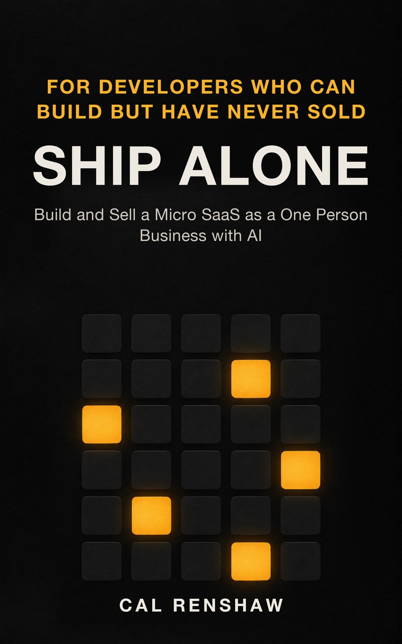
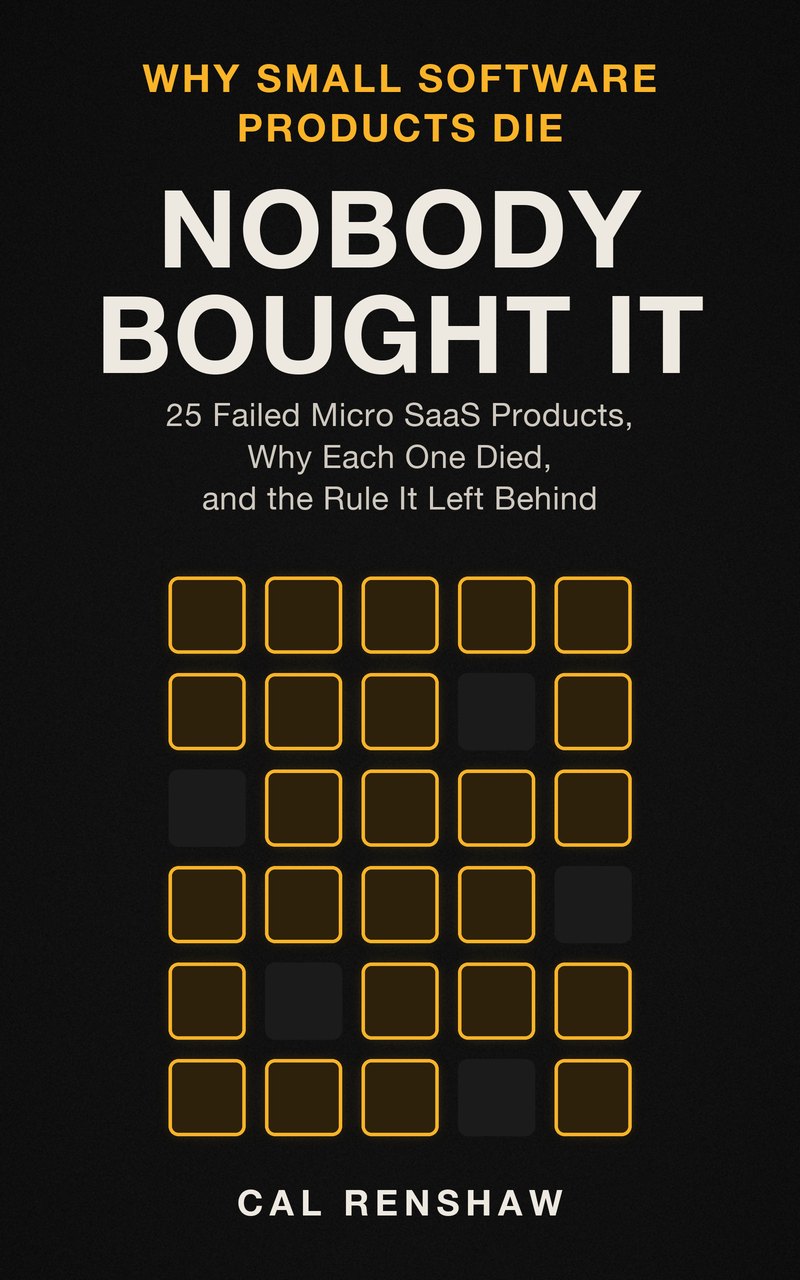
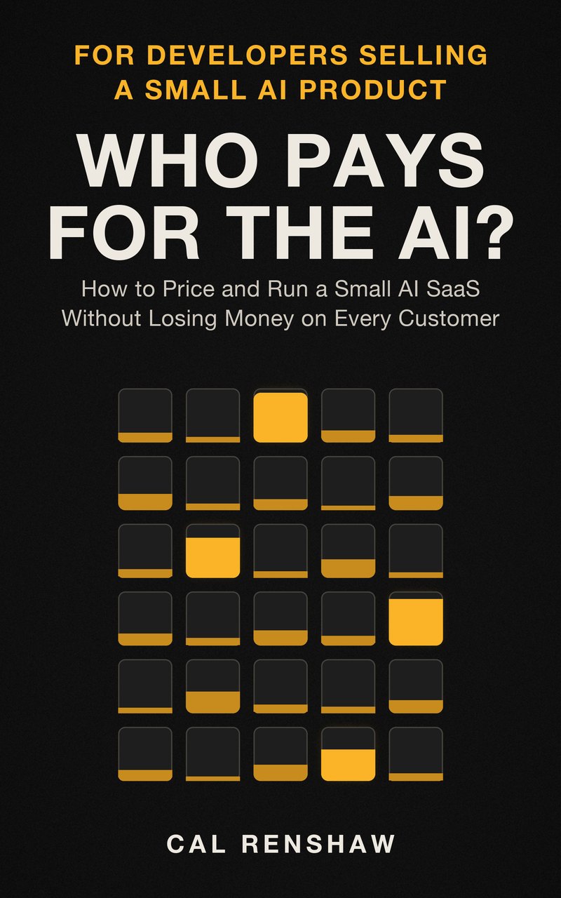
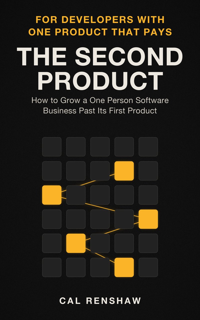
The wordmark is the name in bold capitals, tracked 0.18em, off-white, as it sits at the foot of every cover. The mark is the grid of 30 squares, one per launch, with the 5 still paying lit in amber. Clear space on every side equals the cap height of the wordmark, or one square of the grid.
On the dark field (default)
On light grounds: field-coloured type, grid in stone
Colour
Three colours from the covers, and five screen shades derived from them. One accent only: amber.
Field
#121212
Background of every cover and every page of this site
Off-white
#EDE8E0
Titles, body text and the author's name
Amber
#FBB428
Kickers, links, buttons, and the lit squares in the grid
Muted
#CEC8BF
Subtitles and secondary text (the covers' subtitle colour)
Quiet
#9C978F
Captions, labels and small print
Panel
#1C1C1C
Footer, cards and panel surfaces
Square
#262626
The unlit squares of the grid
Rule
#34322F
Hairlines and borders
Typography
- Inter
- Medium 500, Bold 700, Extra Bold 800. Wordmark, titles, kickers, buttons, labels. The covers are set in Helvetica Neue Bold; Inter is the open web face closest to it, and Apple devices use Helvetica Neue itself.
- Charter
- Regular 400, Bold 700, Italic. Body text, as in the books' interiors. Apple devices use their installed Charter; everywhere else the site loads Charis SIL, built from Charter's designs.
Voice and tone
Short, blunt, first person, no warm-up. 14 years of writing tickets and commit messages for people who weren't going to read past the first line. He doesn't perform confidence: he has been wrong about which of his own products would work every single time.
- Always the cost. "This is slower. Do it anyway."
- Always the number at which he'd drop it. A rule without one is a belief.
- Failure with specifics, never as a humility performance.
- Dry, not jokey. Asides in brackets that point at behaviour everybody recognises.
Do
- Write in the first person singular. I and you, never we: there is no we.
- Name the cost of every recommendation, and the point at which I'd drop it.
- Use figures for numbers above ten, and British English throughout.
- Admit failure with specifics: the product, the month, what killed it.
- Keep the dark field, the off-white title and the amber kicker on every cover and page.
- Use the grid of 30 squares as the only illustration device across the series.
Don't
- Never print a revenue, user or growth figure for any product, alive or dead.
- Never name a real client, employer, competitor or product other than his own.
- Never claim an exit, a funding round, a team or a qualification.
- No em dashes, no hype words (leverage, seamless, unlock, supercharge), no sentence that would work as a conference slide.
- Never use amber for the author's name, and never more than one accent colour.
- Never print a calendar year in a story: the grain is "my third year".
Imagery
Every cover is drawn in code from the same grid, so the series reads as one object seen four ways: the survivors lit, the dead outlined, the grid as meters, the survivors joined. No photographs, no people, no stock illustration. Charts inside the books use navy and pale blue on white, one font, and say in their first words when a figure is a worked example.